
Lorem ipsum dolor sit amet
à portée is a map of Canada coloured by how long it takes to walk to the things a neighbourhood needs — groceries, schools, parks, a pharmacy, a café. It covers every dissemination block in the country, from downtown Montréal to villages the walkability sites skip.
Building it generates a steady stream of small findings: where the data lies, which shapes tell the truth, what a hill does to a fifteen-minute city. Most of that ends up in issue trackers and research notes. The interesting parts will end up here instead, alongside more general writing about walk access in Canada.
Posts can carry the map itself — live, zoomable, coloured with the same data the product serves (scroll right past it; click when you want to explore):
And ordinary figures, when a chart says it better than a paragraph:
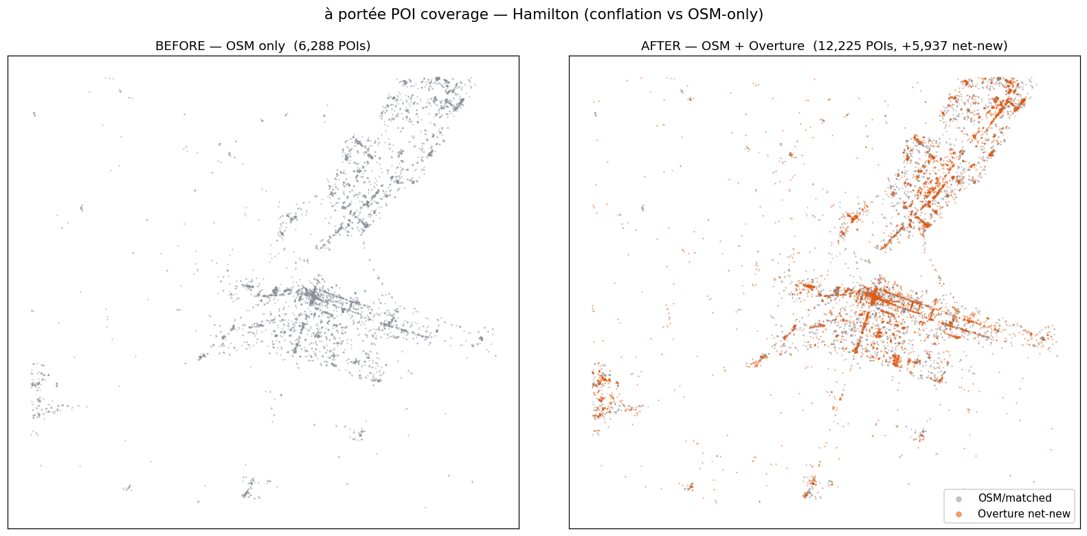
What POI conflation buys: Hamilton had 6,288 points of interest from OpenStreetMap alone; matching against Overture Places brings 5,937 net-new ones. More on that when the conflated data ships.
There’s an RSS feed if you’d like these as they appear.